01: Research
01.a: Initial PO Debrief
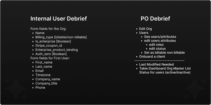
In order to gain a clear understanding of what the scope of this project was, I first met with the stakeholders to go over what they had envisioned this dashboard to be from a functional standpoint. They provided me with a basic list a requirements initially but we would come to have many discussions over the following weeks that would alter that list somewhat.
Key points:
Add a new organization - there must be a way to input all of the organizations information and create a fresh account within our platform.
Modify users within specific organizations - there must be a way in which specific users can be added and removed from an organization within our platform.
01.b: Research Strategy
With everything provided to me in the PO debrief, I was able to being conducting my own research. I wanted to focus on several areas: Primary User interactions, Click through time, and room for growth. This was a foundational project that would need to be expanded as the company grew. Making sure that I had a solid reference/research pool to draw inspiration and guidance from was key to creating good visual clarity in this project.
My research plan was as follows:
Investigate other Super Admin Dashboards in order to discover any documentation or examples of Dashboards with limited user pools.
Interview each of our primary users since this tool was meant for internal use only.
Meet with lead developer to go over their epic to discover any limitations on their end as well as to discuss the findings of my research.
01: Research Findings
Simple is best
After conducting my own research, I ultimately found that the simple and direct approach was going be the most optimal for delivering what the users are asking for the shortest turn-around time. There was some initial confusion regarding the scope of this project but after discussing with internal users, it was ultimately determined that the first phase of this project could and should be simple in form.
The takeaways from that analysis are:
Phased approach is necessary given a limited timeline and demand for the product
2 approaches to take when addressing this issue
Initial creation of organizations with batch user upload
User management (add/remove. Update status, etc)
Primary focus is on developing a scalable system that is primarily made of existing assets.
Simple UI
Limited CTAs in order to promote creation flows and not confuse users on next steps.
Challenges discovered:
Stop solving unasked problems: I found myself often getting pulled towards solving issues that I found myself thinking the users would find cumbersome or frustrating. While some degree of autonomy is necessary and as a designer you should be thinking ahead, it can be a very slippery slope into suddenly designing for the perception of the user and not the users themselves.
02 : Design
02.a: Phase 1
Given the short time frame to get this done and the substantial amount of prerequisite research/ reference gathering had already been done, I decided it was best to move straight into the mid-high fidelity mock up portion of this design with the goal being to reuse as many existing assets as possible while also using this as an opportunity to propose a new layout that would be more appropriate for this specific use case.
Point of consideration:
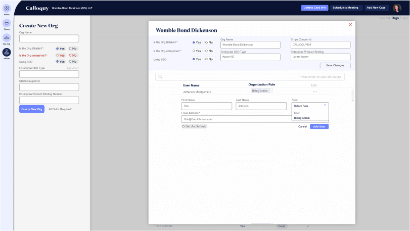
I wanted this to mimic our in-platform experience as much as possible when it came to certain elements of this design. Part of this was reusing existing assets and as such I saw and opportunity to maintain an existing flow as well. I was able to fully mimic our user creation flow in our new org creation flow given that there was a nearly 1:1 requirement of both sides.
02.b: Phase 2
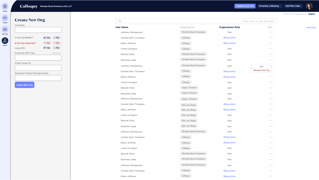
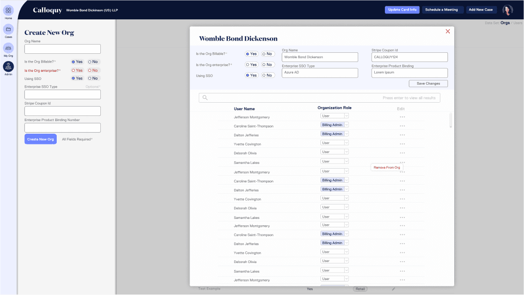
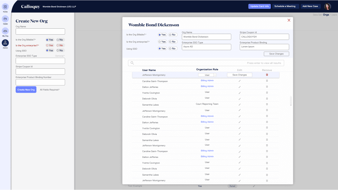
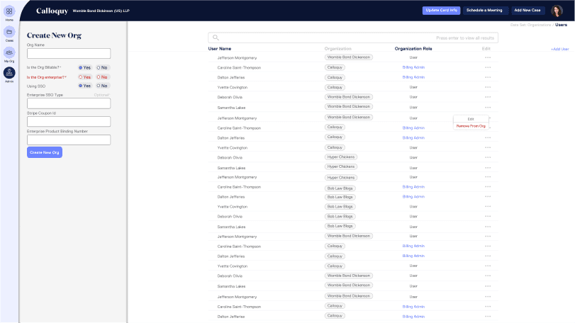
Phase 2 was to incorporate a larger range of features within our platform and introduce user management within the dashboard. This would mean additional opportunities to continue reusing existing assets and flow from the main, external, platform.
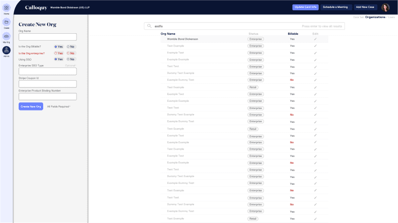
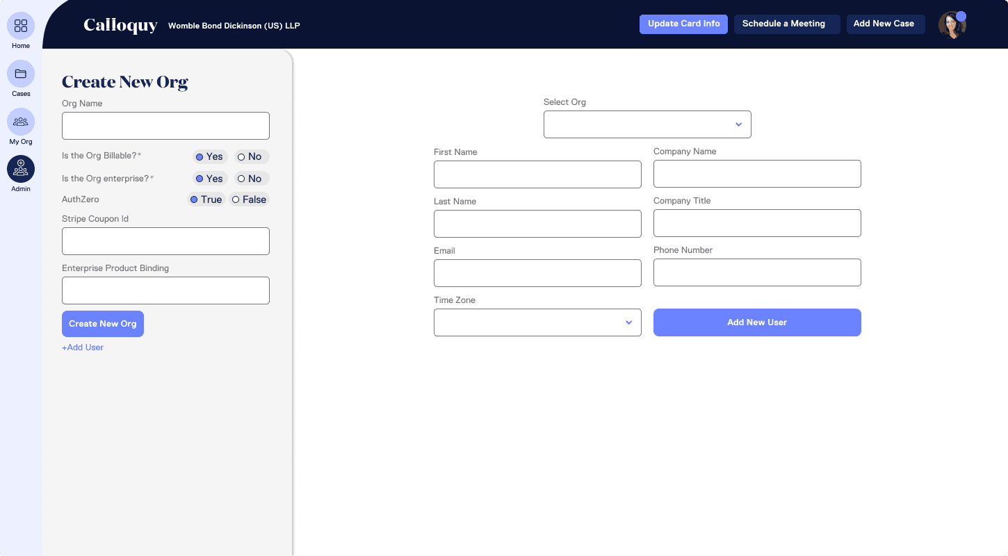
Super Admin Phase 1: Mock Up
For clarity: this was designed on a 1450x800pxl frame in accordance a previously set up design style guide.
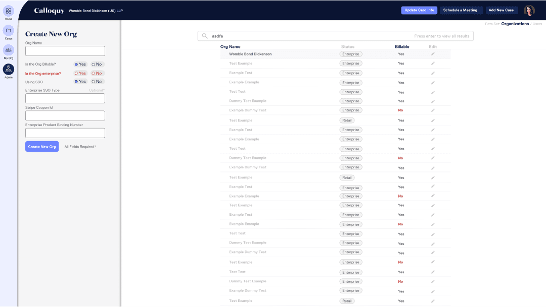
At this stage the ask was primarily for a basic form that aligned with the back-end work that our primary users would need to be doing anyways as part of the on-boarding process. Seeing this as an opportunity, I repurposed our initial sign up page form and was able to fit it within the page. I had reservations about how bare the page looked with only these simple forms but after discussing the project's end goal and the full capabilities that our users would want, I realized that in later phases this page would come to be fully flushed out.
Primary Goal: Minimize user click through time
Secondary Goal: Remain as accurate to the back-end language as possible. (primary user request)
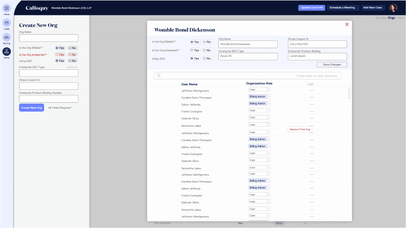
Outlook Phase 2: Mock Ups
Notable changes from phase 1:
01 K.I.S.S.
Maintaining a simple and straight forward design was truly the area that received the most praise from our users. When talking with one of them during my research phase, they remarked on how bloated and complex other admin dashboards are and how they would prefer as streamlined of a design as possible. This was ultimately the guiding light for this project.
02 Focus on the questions asked before the questions made
As I mentioned in the findings portion of my research, I would often go off on tangents trying to solve issues I had invented as opposed to staying on track and focusing on the problems proposed by our users specifically. Maintaining a "user first" mentality was something that I was reminded of during this project. One of the ways I was able to correct this train of thought was through open dialog with our users.
Info Dump
Testimonial
"That was fun." I constantly found myself thinking this after interacting with Jacob, from both a personal AND a professional stance. He is wonderful in his UI/UX work, and often times in walking through his decisions he would find the best ways to get you invested. It is this creativity that makes Jacob such a valuable asset to whatever he does. Creative in his designs, creative in his approach, creative in his speech, creative in his thoughts. It was truly a joy to have Jacob on my team."

