Outlook Addin
01: Research
01.a: Initial PO Debrief
In order to gain a clear understanding of what the scope of this project was, I first met with the Product Owners to go over what they had already been discussing with stakeholders. They informed me of the users requests for an outlook add-in in order to manage their meetings. The product owners also provided me with a link to an initial Jira epic that contained a breakdown of the project.
Key points:
Users primarily rely on Outlook for handling their calendars.
Users want the ability to schedule meetings within outlook.
This should be designed with expansion in mind.
This project is in high demand so their is a desire for a quick turn around.
01.b: Research Strategy
With everything provided to me in the PO debrief, I was able to being conducting my own research. I wanted to focus on several areas: any baseline Outlook add-in specific design requirements from Microsoft, how our users were currently managing their calendars, and if there were any limitations from our current platform that may impact the design of the add-in.
My research plan was as follows:
Investigate outlook in order to discover any documentation specific to add-in development/design.
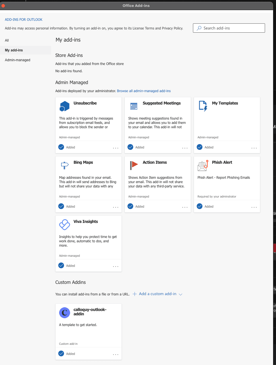
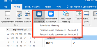
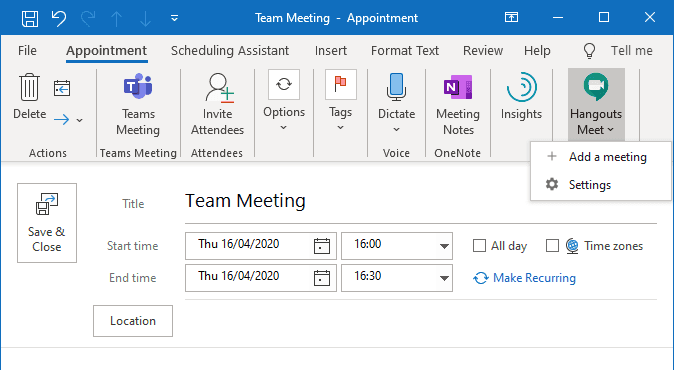
Conduct an analysis of other existing meeting scheduler add-ins within outlook
Meet with lead developer to go over their epic to discover any limitations on their end as well as to discuss the findings of my research.
01: Research Findings
Copy Paste from Figma
Ultimately the documentation from Microsoft provided helpful general guidelines and pointed me to the use of Fluent UI in order to provide basic structure, but ultimately it lacked the specificity that I needed. While Microsoft does provide Sketch and Adobe XD files for you to brows, unfortunately our company only utilized Figma and thus I was unable to access these files. The analysis of other scheduling add-ins within outlook provided the greatest source of inspiration and guidance on what my next steps should be.
The takeaways from that analysis are:
Phased approach is necessary given a limited timeline and demand for the product
2 approaches to take when addressing this issue
Pop-out modal
Side tab with responsive expansion/collapsing
Primary focus is on proving as many configuration tools as possible
Simple UI
Limited CTAs in order to promote creation flows and not confuse users on next steps.
Challenges discovered:
Microsoft ultimately did not provide the specificity I would have preferred such as recommended pxl resolutions (1920x1080, etc.)
Limited by internal code: Internal development structured set in place by previous development team limited our ability capture and manipulate user data/inputs in order to allow for certain functions to be feasible.
Outlook Addin
02 : Design
02.a: Phase 1
Given the short time frame to get this done and the substantial amount of prerequisite research/ reference gathering had already been done, I decided it was best to move straight into the mid-high fidelity mock up portion of this design with the goal being to reuse as many existing assets as possible while also using this as an opportunity to explore a new platform (ie Outlook vs Web browser).
Points of consideration:
Scope alignment had been an issue when communicating with stakeholders, so I wanted to provide simple UI that could be easily modified given how often the scope would be adjusted.
I wanted this to mimic our in-platform experience as much as possible given that we were still very much in the "first impressions" stages as a company.
Although the goal was to reuse as many existing assets as possible, the dev team did want to explore what all Fluent UI had to offer and so we utilized their break point structure in the short-term with plans on incorporating more in later iterations.
02.b: Phase 2
Phase 2 was to incorporate a larger range of features within our platform and open up the meeting type selection to now include all meeting types. This posed new challenges that I often spent time communicating with the developer over. Chief amongst these challenges was determining what the overall goal of this add-in was. Given the previous issues with scope change during phase 1, Lead Dev, myself, and the product owner we had engaged in our conversations all agreed that the best course of action was:
Maintain simple UI that mirrored the in-platform experience as much as possible.
There was a call to explore managing previously scheduled meetings within the add-in as well, but this was ultimately scrapped due to it being too large of a dev lift.
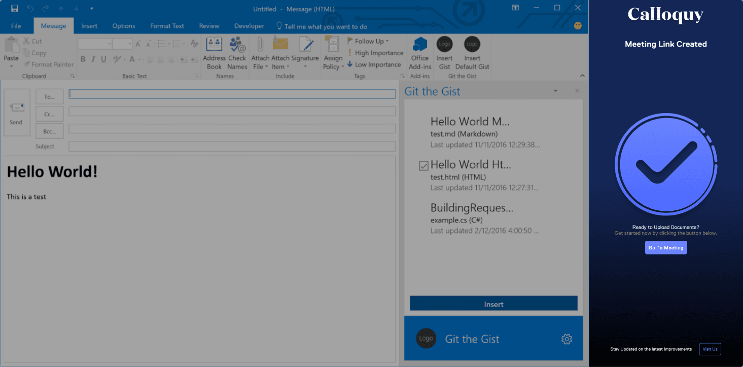
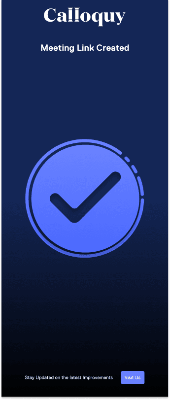
There was an initiative to encourage users to be more active the browser-based platform; thus, the success page now included a list of additional features only found within our platform.
Outlook Phase 1: Early Drafts
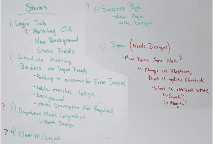
Early Design Discussions
The project itself came together during several white boarding sessions with stakeholders. There were issues we faced given that the decision had been made to use an external dev team that would be fairly off-step with us in terms of schedule and communication.
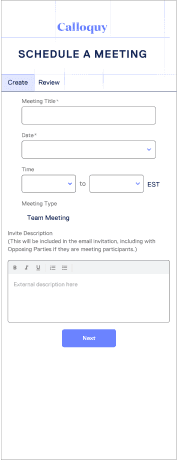
Discussions lead to Ideas
Taking the conclusions and asks derived from the initial stakeholder white boarding session, I began to design some rough wireframes in order to gain more consensus amongst the stakeholders and to begin ironing out any misconceptions that may have developed on either end.
Early Draft Issues
Working with an outside team created some issues when trying to translate designs across not only different languages, but differing time zones as well. It took constant communication and a willingness to do a little extra in order for us to correct those mistakes and still deliver.
Outlook Phase 1: Mock Ups
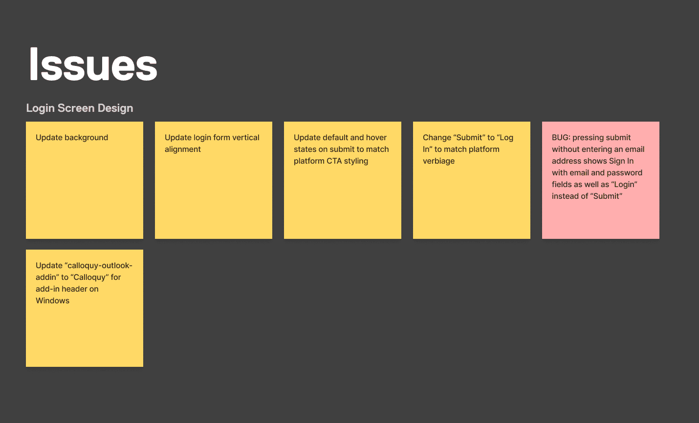
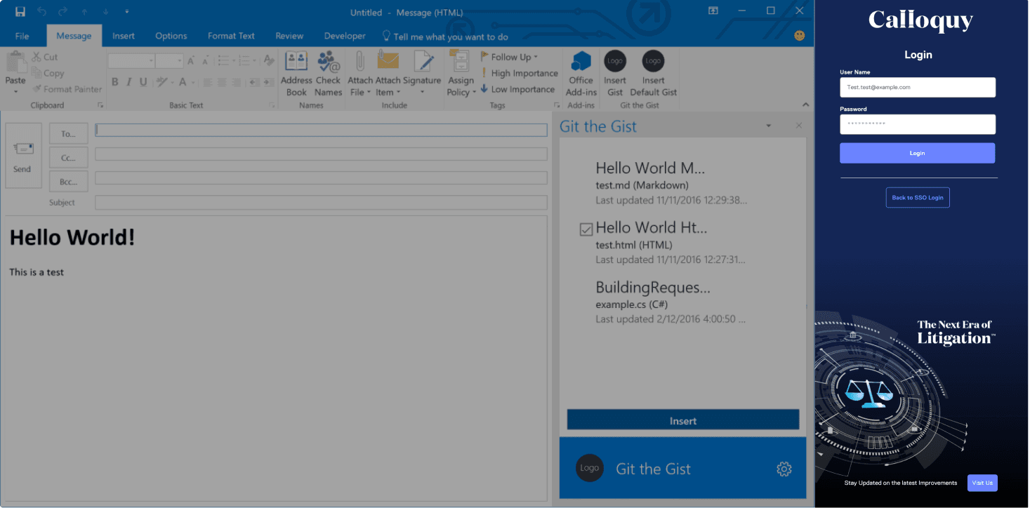
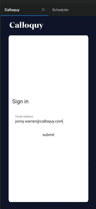
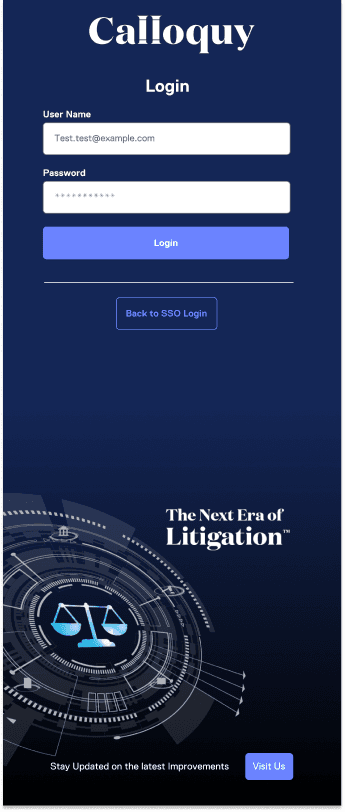
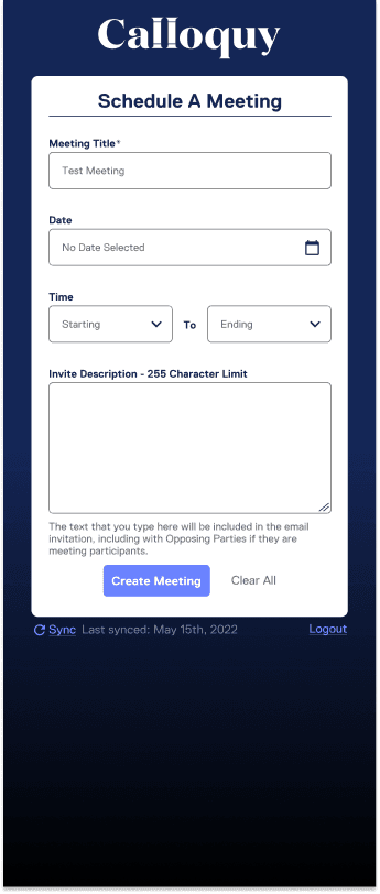
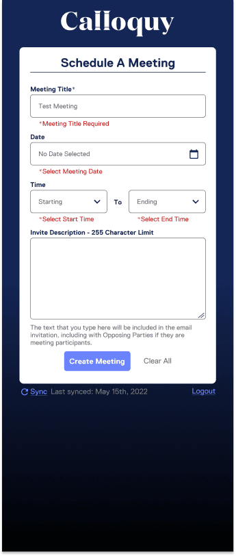
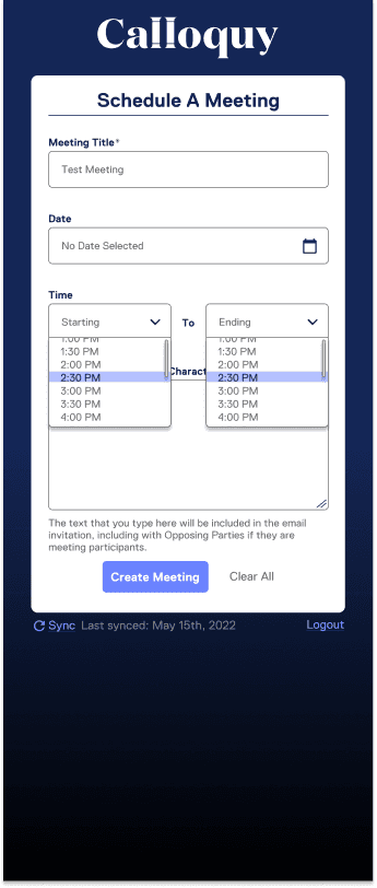
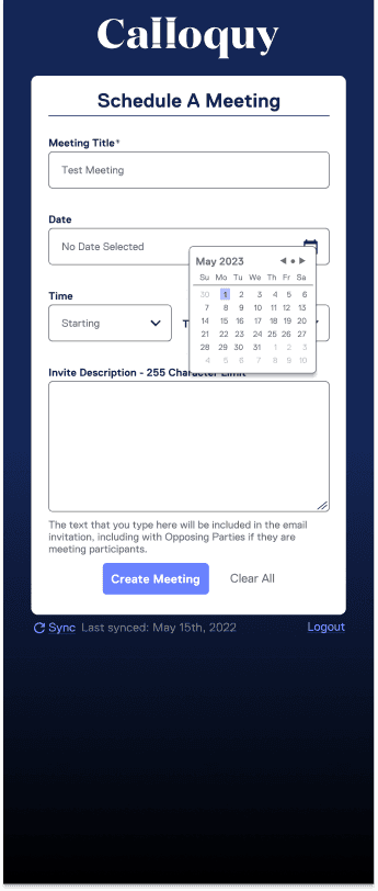
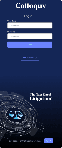
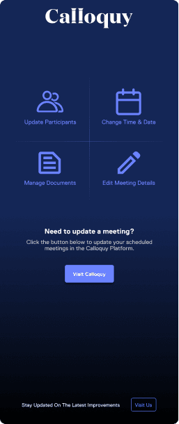
The primary goal of this phase was to be simple and direct with the UI. I wanted users to feel like the are simply filling out the same form they would within our platform without anything new to introduce pain points. Fortunately, I was able to reuse nearly every asset from our main platform when designing. However, I did take the opportunity to update the styling and contrast on several components to be compliant with WCAG 2.1 standards. As a tertiary goal during this project, I wanted to conduct a small audit of our existing components and begin updating them to meet WCAG standards. I was also able to use this opportunity to meeting with our graphic design team to have the login screen graphic created as well as using this time to open up communication channels to ensure that the entire company is running under a unified understanding of the product.
The focus had shifted to only allowing the creation of Team Meetings.
Primary Goal: Minimize user click through time
Secondary Goal: Reuse as many existing assets as possible
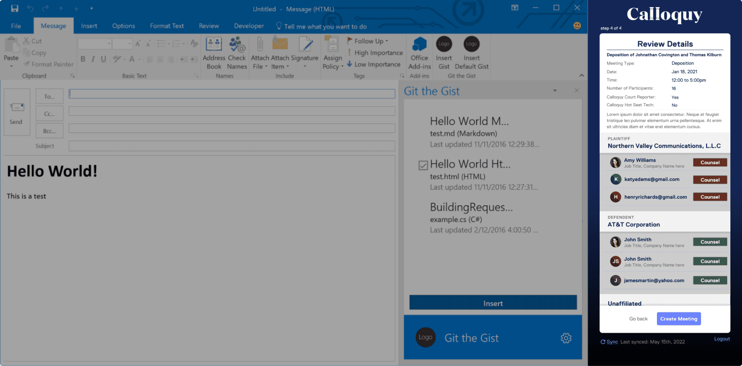
Outlook Phase 2: Mock Ups
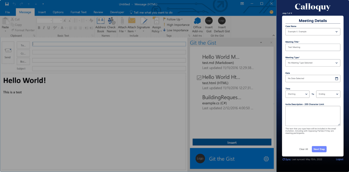
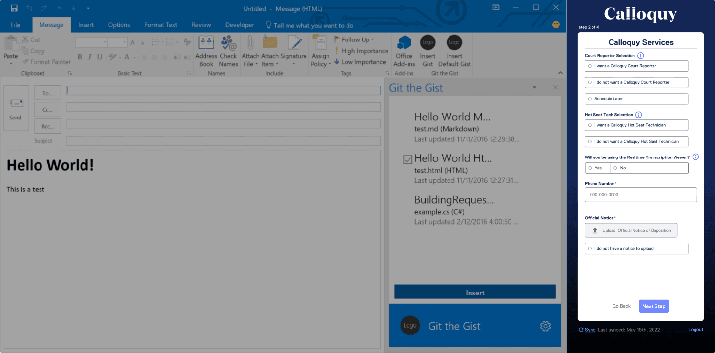
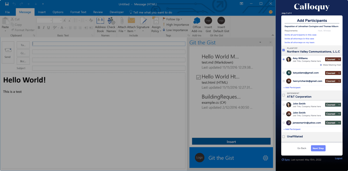
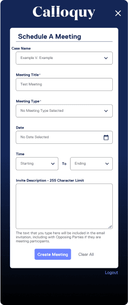
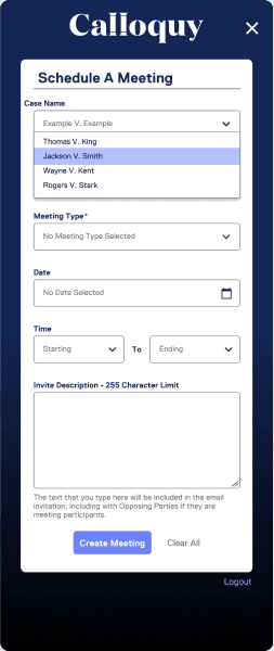
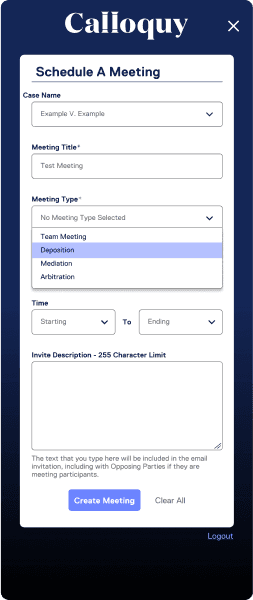
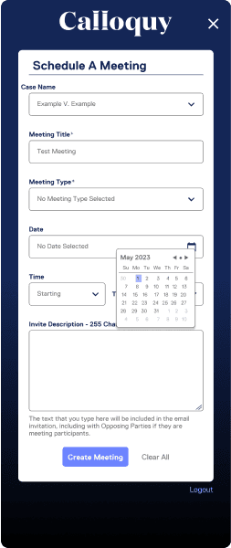
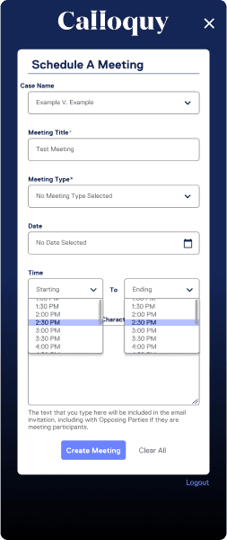
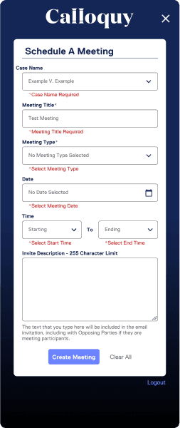
Phase 2 was a chance for me to improve upon the some of the foundational work I had done in phase 1. I was now able to introduce other key features from our main platform into the add-in such as the ability to create meeting that are directly related to a case within our platform. Although this was going to be a relatively easy addition on my part ( adding in the case selector ) I wanted to make sure to work with developers as much as possible due to the large back-end lift on their part. While part of my goal was always to reuse as many existing components as possible, I wanted to be open to exploring new alternatives as well if it meant an easier development cycle while still meeting user goals.
Additions:
Case name
Meeting Type selector
"X" button to close tab
Redesigned the "success" page to be more proactive for users
01 Recycling isn't just good for plants
This is where a proper design system would have been useful. However, I had implemented a basic organizational structure that made finding previous assets for reuse much easier.
02 Spend more time in discovery
The issues I faced when determining scope could have and should have happened much earlier than they did. I made the decision to start implementing more decisive meetings once scope began to shift more and that adjustment in meeting structure helped align the ship.
Info Dump
Testimonial
“Jacob is an incredibly talented UI/UX designer. He always came up with excellent work, answered any questions us SWE's had, and is a super friendly person. You can tell he is incredibly intelligent and I think he could pick up any new concept or role very quickly.”

